ORANGE COUNTY REGISTER
Stater Bros. is giving itself a facelift for its 83rd birthday.
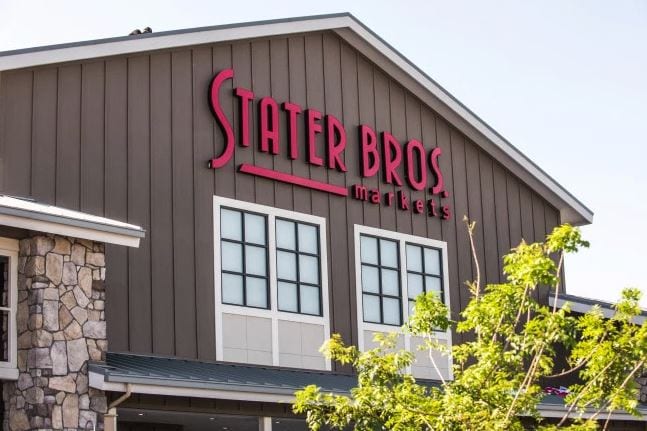
The supermarket chain, with all 172 stores in California, last week unveiled in Tustin a new store logo featuring a modern font that’s replacing a 1970s-era look.
Stater Bros., known for a working-class image, has been quietly giving its stores a hipper look in recent years to meet customer demands. It’s added everything from cut fruit offerings to sushi to expanded wine and beer selections. And it’s repainting, reflooring and relighting interiors with friendly, warmer tones. By October, the chain hopes to have refurbished the interiors of 45 of its stores.
So can Stater Bros. convince the public it’s now “cool” to shop there?
According to a tape of the Tustin ceremony, Stater Bros. marketing Executive Vice President Dennis McIntyre said the stores’ new inside look is “Simple, clean and uncluttered. We want our customers to have a relaxing shopping experience.”
But leaders of the company, which celebrated its 83rd birthday Aug. 17, also realized the internal upgrades were not well communicated by dated corporate imagery. You know, a style only a grandparent could love.
Its old corporate icon looked to me like a county-fair award using the brash and bulky “Cooper” font that was a hot look almost a half-century ago.
The new logo — certainly a cleaner corporate emblem — was unveiled at one of the chain’s newer locations in a residential neighborhood on the old Tustin helicopter base. It’s also on the chain’s website and atop the Stater Bros.’ weekly mailer, along with a page that explains the rebranding’s rationale.
Customers, McIntyre said, “didn’t know the changes were there. So we knew we had to do something on the outside to show people we did something new on the inside.”
The new store signage incorporates a smart tip-of-the-cap to its history, featuring a leaner type style that’s similar to what’s inside the old icon and was once displayed on some of the chain’s older stores. If I must say so, the new look feels more coffee house than a supermarket.
Now, bridging generations with branding often is a tricky endeavor. And Stater Bros is not unique in trying to lure youthful shoppers while keeping older ones happy.
What will be extra challenging for States Bros. is “hip” imagery can translates to consumers as a vibe of a pricey place — something this chain is not.

